Selected works
Information Storytelling
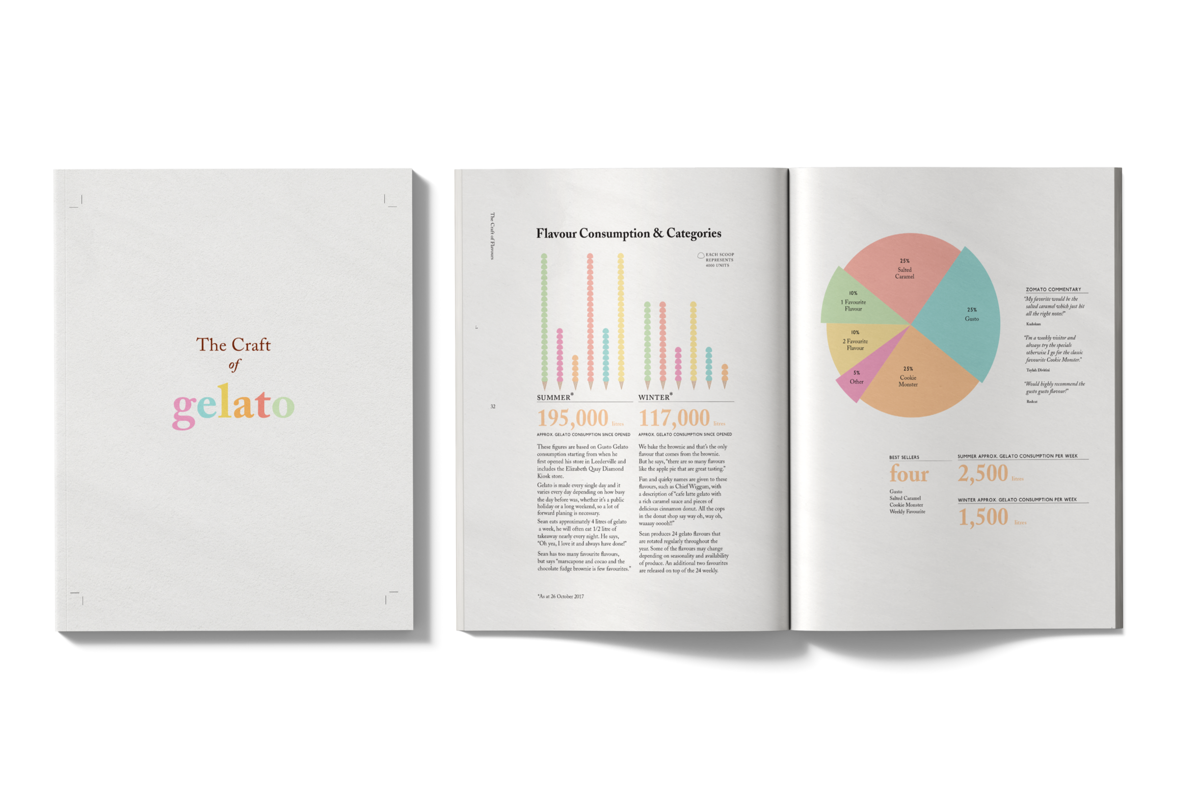
Gusto Gelato
A research-led project that gathered Gelato craft knowledge through interviews, museum collaboration, workshops, and audience analysis, developing a visual language system that transformed technical information into educational publications, infographics, and navigation tools like the flavour mood-map.
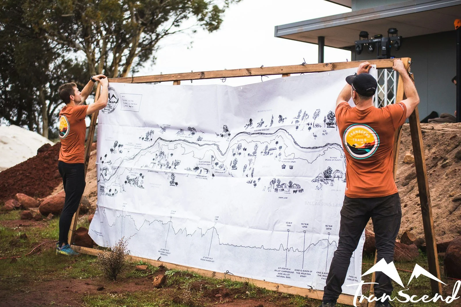
Transcend Trails
An information-driven cartographic / prospecting map inspired design that documented the Avon Valley's landscape, indigenous heritage, native ecology, and trail running route into one cohesive visual narrative, integrating historical context, topographic data, and race logistics so participants could understand terrain, anticipate challenges, and connect with the cultural significance of place.
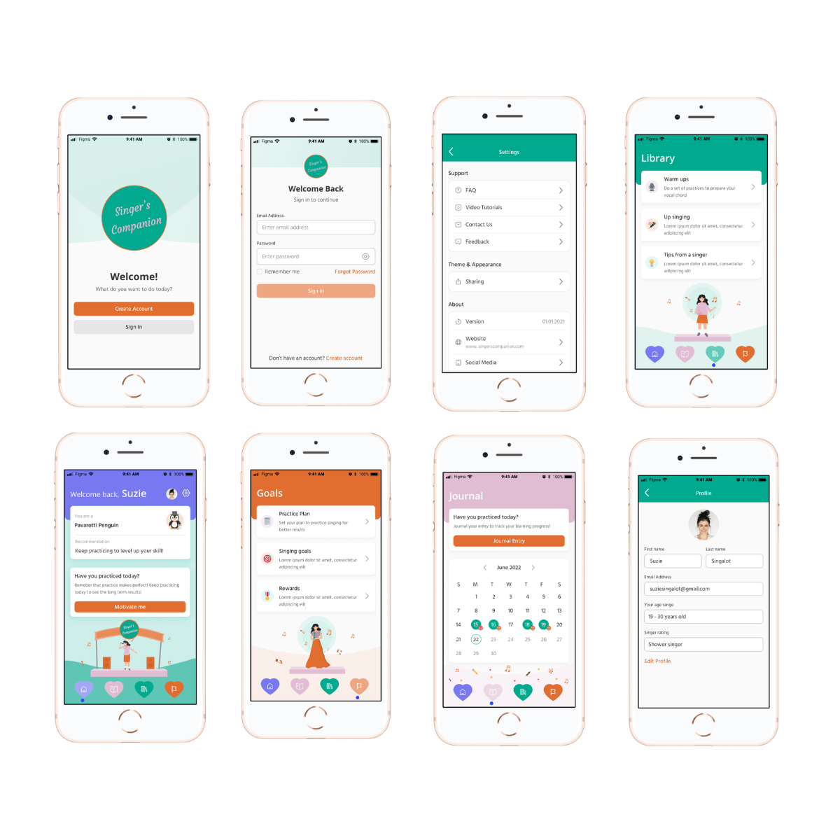
Singing Companion
We helped develop this singer’s app with a focus on information-driven learning. Every practice session collects detailed data, recordings, playback, performance ratings, and progress through modules and tests, transforming each session into actionable insights. By analysing this information, the app highlights strengths, pinpoints areas for improvement, and guides singers through structured routines and learning techniques. In this private, supportive environment, every note, repetition, and feedback point contributes to a story of growth, helping users (singers) build consistent habits and measurable skill development.
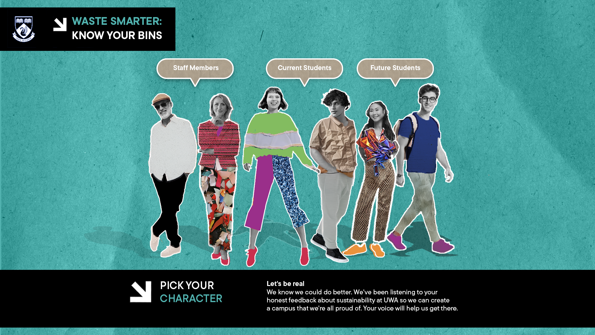
University of Western Australia Sustainability
Worked closely with the Sustainability team to thoughtfully present the valuable research, programs, and impact occurring at UWA in a way that resonated with both internal and external audiences on digital screens. This involved shaping the narrative, structuring information with clarity, and designing visuals that made the content accessible, compelling, and aligned with UWA’s broader vision and values.
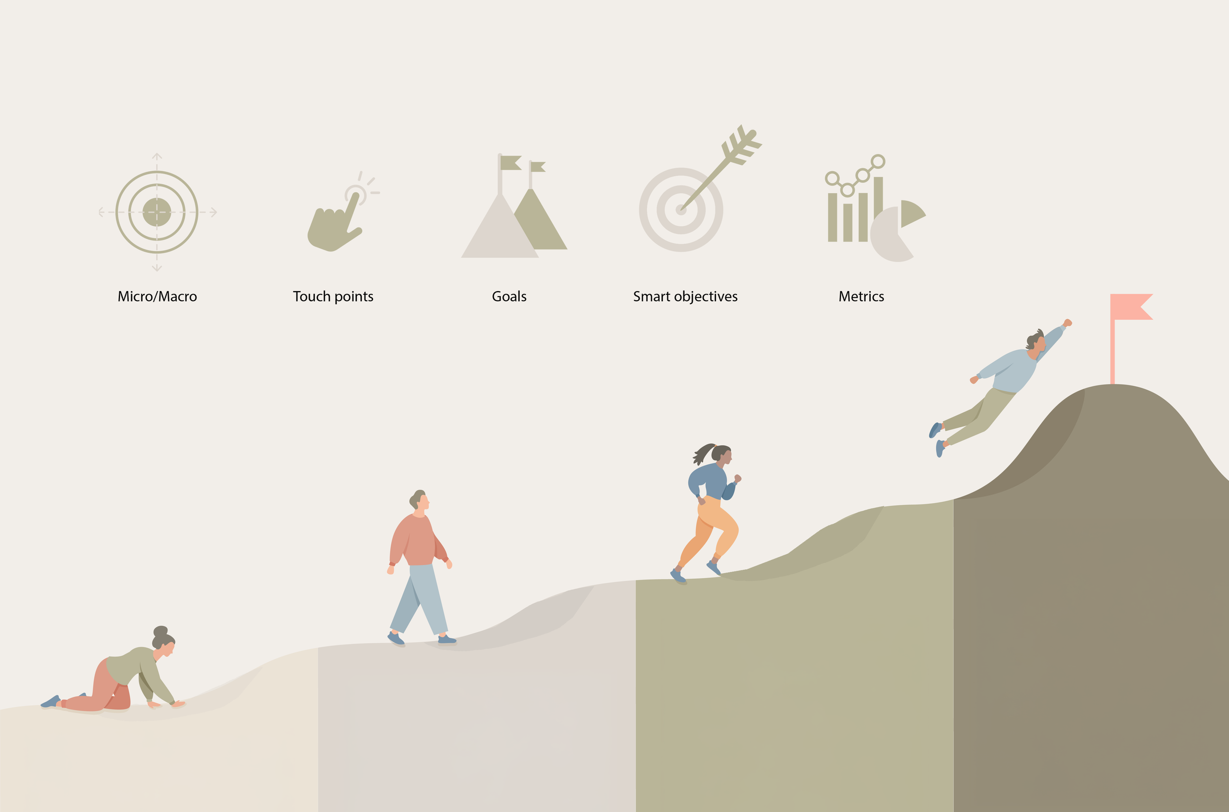
Penn & Lytics
We partnered with Penn & Lytics, a strategic marketing data analytics firm, to turn complex marketing data into clear, engaging visuals. Through custom infographics and storytelling graphics which was used for presenting and reports, we simplified insights to make them actionable for clients, supporting program explanations, one-on-one consultations and so much more.
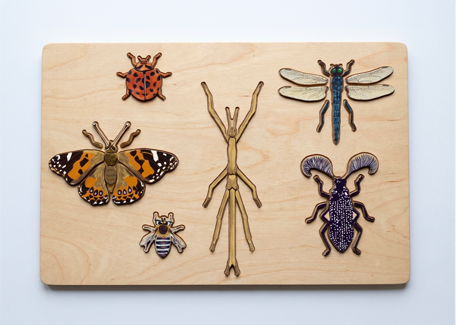
Kids Nature Club
For Kids Nature Club, we hand-drew five Australian insects. These illustrations transformed native species into engaging characters for a science-based educational puzzle, helping children learn about invertebrates and Australia’s unique ecosystem. Through research, sketches, and careful revisions, each insect was depicted with correct colour and with anatomically correct antennas, wings, legs, eyes, head, and body, capturing the unique nature of Australian insects.
Westgold Resources Limited
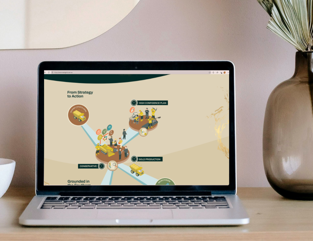
Worked with Westgold Resources on a communications project to showcase their three-year plan to internal teams and stakeholders for better communication and cultural engagement. The information was provided in fragmented pieces, so we developed a clear narrative and structured the flow. We then created custom visuals and information storytelling to effectively articulate the plan. The content was delivered through an interactive digital website, allowing viewers to explore and engage with the information click by click.
RLF Ag Tech
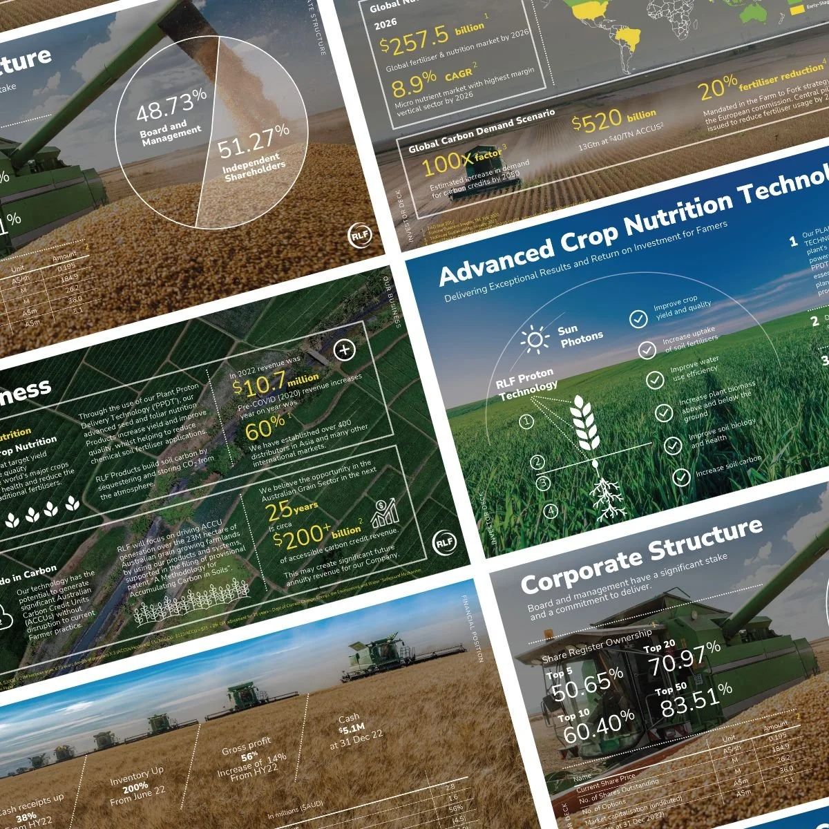
We created customised information storytelling displays for RLF Ag Tech used on multiple presentations and communications, designing data-driven visuals to be showcased to stakeholders and shareholders worldwide. We set up a visual style language and visually explained the product process, highlighting its benefits.
Hitachi Rail
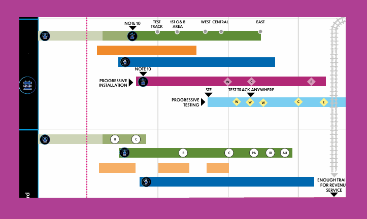
Worked on creating a 10-year rail tender plan, initially presented in complex Excel sheets containing information from multiple stakeholders with little clarity. This was infographic that wasn’t just represented with straight facts, but actually showcased the user experience, journey and storytelling aspect using the information. We developed a structured system incorporating a key, legend, colour coding, icons, and a visual framework to help interpret the data, understand the goals, and highlight the successes of the plan. An engineering consultant was engaged to provide further insight and ensure the visuals accurately and clearly conveyed the information.
Maria Doyle
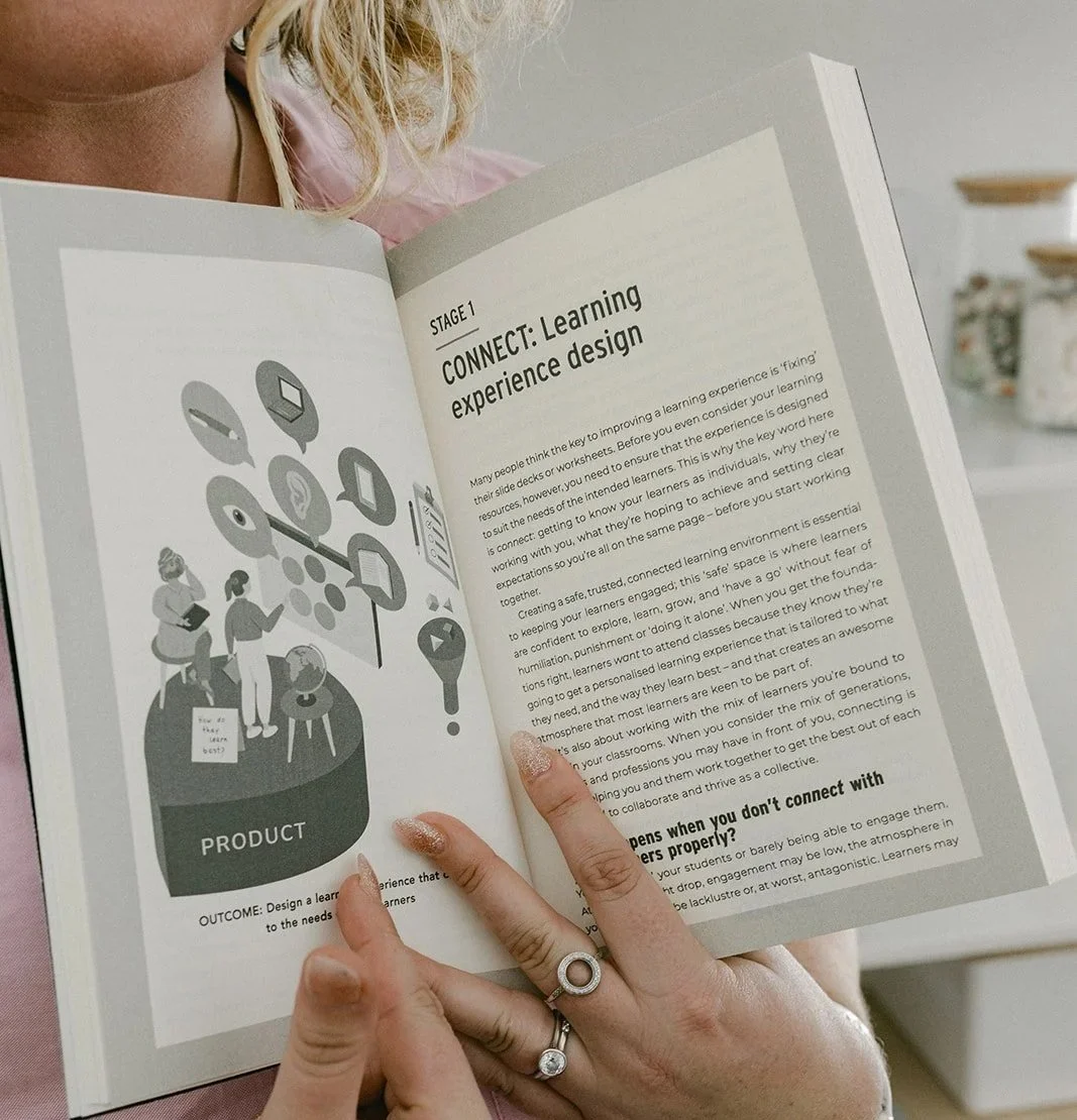
We worked with Maria Doyle’s website, extraordinary learning experiences and methodology, collaborating to create a clear visual language that showcased her four‑stage teaching and learning philosophy. Drawing on key concepts from her work and book Everyone’s a Teacher, we translated her instructional approach into compelling visuals that illustrated the process, purpose, and benefits of her methodology. This helped make her educational framework easy to understand and engaging for audiences interacting with her content.
Information that moves
•
Information that connects
•
Information that illuminates
•
Information that moves • Information that connects • Information that illuminates •




-
![A woman with shoulder-length blonde hair, wearing a white shirt, smiling outdoors with a tree and yellow flowers in the background.]()
"She brings words and concepts to life with next-level visuals that make you stop and think, and inspire double-clicks. Working with her to tell a story has been an exciting, rewarding, and super fun process!"
– BookLeaf Copy | Adele Hollywood
-
![A smiling woman with wavy blonde hair and hoop earrings, wearing a black sleeveless top, against a white background.]()
"Working with Alysha was simply amazing. From start to finish the process felt seamless. Marketing analytics can often be perceived as boring and hard to interpret, which is why I engaged Alysha to help me tell the story of data and analytics through illustrations. "
- Pennandlytics | Brooke Huckerby | Marketing Analytics & Strategy Consulting
-
![A woman with short, wavy, blonde hair smiling, wearing a shiny pink blouse and a gold necklace, with a warm brown gradient background.]()
"Her ability to work her magic from a basic word draft and turn it into a to something worth reading is incredible. A standout for the infographics she creates from just words into a beautiful visual that all works together."
- Founder + Director Jackie Stapleton | Quality Systems + Auditing Specialist